


Black is one of the most common colors in our closets. It is easy to find, simple to coordinate, and often feels like the safest option when you do not know what else to wear.
But what happens when you have a color analysis and discover that black is not actually one of your best colors?
First, you do not need to throw away every black item you own.
Learning how to wear black when it isn’t in your color palette is really about understanding placement, contrast, texture, and balance. With a few thoughtful adjustments, you can continue wearing the black pieces you love without allowing the color to overpower your natural coloring.
As a True Spring, black is not one of my best colors either. I understand the frustration of discovering that one of the easiest wardrobe neutrals is not technically in your palette. Color analysis is not supposed to take away the clothes you love. It should give you better tools for styling them.

Why Black Can Be Difficult to Wear
Black is an extremely deep and visually strong neutral. It creates a significant amount of contrast, especially when it is worn close to the face.
That contrast can be beautiful on someone whose natural coloring is cool, deep, or naturally high contrast. It may be more challenging for someone whose coloring is lighter, warmer, softer, or more delicate.
When black is not in harmony with your coloring, you might notice that it:
- Creates shadows under your eyes
- Makes redness or unevenness more noticeable
- Causes your skin to appear dull or tired
- Overpowers your features
- Makes you feel like the outfit is wearing you
This does not mean black is objectively bad on you. It simply means you may need to style it more intentionally.
Can You Wear Black If It Isn’t in Your Color Palette?
Absolutely.
Your seasonal color palette is a guide, not a list of rigid fashion rules. It shows you which colors naturally support your undertone, intensity, depth, and contrast. You can still wear colors outside your palette when you love them or when they are already part of your wardrobe.
The goal is to understand why a color may not be your most flattering and then use styling techniques to create more harmony.
8 Ways to Make Black More Flattering
1. Keep Black Away From Your Face
The simplest strategy is to wear black below the waist.
Black pants, skirts, shorts, shoes, and handbags will have very little effect on your complexion. Pair them with a top in one of your best seasonal colors, and you can still enjoy the versatility of black without placing it directly underneath your face.
This is especially helpful for lighter seasons such as Light Spring and Light Summer, where a solid black top may create too much depth and contrast.
2. Choose a More Open Neckline
A high black crewneck or turtleneck places a large block of black directly next to your face. An open neckline creates space between the color and your complexion.
Consider trying:
- A V-neck
- A scoop neck
- A square neckline
- An off-the-shoulder style
- A button-down blouse with the top buttons open
- A black dress with a lower or more open neckline
Allowing more of your natural skin tone to show can soften the overall effect of the black.
3. Add One of Your Best Colors Near Your Face
If you are wearing a black dress, blouse, or jacket, introduce a color from your seasonal palette near your face.
You could add:
- A colorful scarf
- A cardigan or blazer
- A statement necklace
- Colorful earrings
- A jacket with a flattering collar
- A lipstick in one of your best shades
For example, a True Spring might combine black with coral, warm turquoise, or bright green. A Soft Summer might add dusty rose, soft blue, or muted lavender.
The flattering color helps redirect attention toward your face and makes the black feel more connected to your natural coloring.
4. Look for Softer Versions of Black
Not every black fabric looks equally intense.
A flat, solid black fabric can appear stronger than washed black denim, faded linen, lace, chiffon, or a fabric with texture and movement.
Try looking for:
- Washed or faded black
- Black lace
- Sheer black fabric
- Heathered black knits
- Black prints that include your palette colors
- Black fabric with a soft sheen or visible texture
Breaking up the solid block of color can make black much easier to wear.
5. Use Makeup to Restore Balance
Makeup can help support your natural coloring when you wear a color that is not in your palette.
You do not need to apply heavier makeup. Instead, focus on adding the right colors back into your face.
Try using:
- A lipstick or gloss from your palette
- A flattering blush
- Bronzer if warmth supports your coloring
- Defined brows or lashes if you need more contrast
- An eyeshadow that coordinates with your undertone
For warm seasons, this may mean adding peach, coral, warm pink, or golden tones. Cooler seasons may benefit from rose, berry, plum, or cool pink.
The goal is not to compete with the black. It is to keep your face from disappearing next to it.
6. Choose Jewelry That Supports Your Undertone
Jewelry sits close to your face, which makes it one of the easiest ways to create a more flattering transition between black clothing and your complexion.
Warm undertones may prefer black paired with yellow gold, bronze, copper, or warmer mixed metals. Cool undertones may prefer silver, platinum, white gold, or cool-toned pearls.
Your best jewelry metal can bring back some of the warmth, coolness, softness, or brightness that the black may be missing.
7. Repeat Black Somewhere Else in the Outfit
When black appears only once, particularly close to your face, it can feel disconnected from the rest of your look.
Repeating black through your shoes, belt, bag, glasses, or a subtle print can make the color feel more intentional. This creates visual balance and helps the black belong within the complete outfit rather than becoming the only thing you notice.
8. Replace Black With a Better Deep Neutral
Sometimes the easiest solution is to choose a dark neutral from your own palette.
You can still create the polished, sophisticated effect of black without using true black itself.
Depending on your season, consider:
- Warm navy
- Soft navy
- Charcoal
- Espresso brown
- Chocolate brown
- Deep olive
- Aubergine
- Deep teal
- Cocoa
- Soft black
These colors may give you the depth you want while creating a more natural connection to your skin, eyes, and hair.
The Best Black Alternatives for Each Seasonal Family
Your exact neutral recommendations will depend on your individual sub-season, but these are helpful places to begin.
Spring
Springs often look more harmonious in warm navy, chocolate brown, camel, cognac, deep teal, or a warm charcoal. These neutrals maintain warmth and brightness without creating the severity of solid black.
Summer
Summers may prefer soft navy, charcoal, cocoa, pewter, muted plum, or a softer blue-gray. These colors support Summer’s coolness without overpowering its naturally softer intensity.
Autumn
Autumn palettes often work beautifully with espresso, chocolate, dark olive, warm navy, aubergine, or deep warm teal. These neutrals provide richness and depth while maintaining warmth.
Winter
Many Winter palettes naturally support black because their coloring can accommodate greater depth, coolness, and contrast. Depending on the specific Winter sub-season, charcoal, ink navy, or deep cool burgundy may also work as alternative neutrals.
Which Color Seasons Look Best in Black?
Black tends to be easiest for people with cool, deep, or naturally high-contrast coloring, particularly many Winter palettes.
However, seasonal family alone does not tell the entire story. Two people within the same season can have different levels of depth and contrast. Someone outside the Winter family may still wear black reasonably well, while another person may find that it overwhelms them immediately.
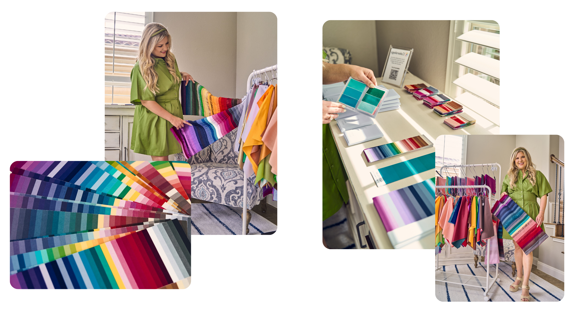
This is one reason professional draping is so useful. It allows you to see how black actually interacts with your individual complexion rather than relying only on generalized seasonal rules.
Do You Need to Remove Black From Your Closet?
No.
I rarely recommend getting rid of an entire category of clothing immediately after a color analysis. Start by paying attention to which black pieces you actually enjoy wearing and which ones consistently make you feel tired, washed out, or disconnected from your outfit.
Keep the pieces you love and experiment with the styling strategies above. As those items eventually need to be replaced, you can begin choosing more flattering neutrals from your palette.
This creates a gradual and realistic wardrobe transition instead of making your color analysis feel restrictive or wasteful.
Final Thoughts
Color analysis is not about being told that you can never wear a certain color again. It is about understanding how color affects your appearance and learning how to make more intentional choices.
If black is an important part of your personal style, continue wearing it. Place it thoughtfully, add your best colors near your face, support it with flattering makeup and jewelry, and explore alternative neutrals when you are ready to purchase something new.
Knowing your palette gives you options. It does not take them away.
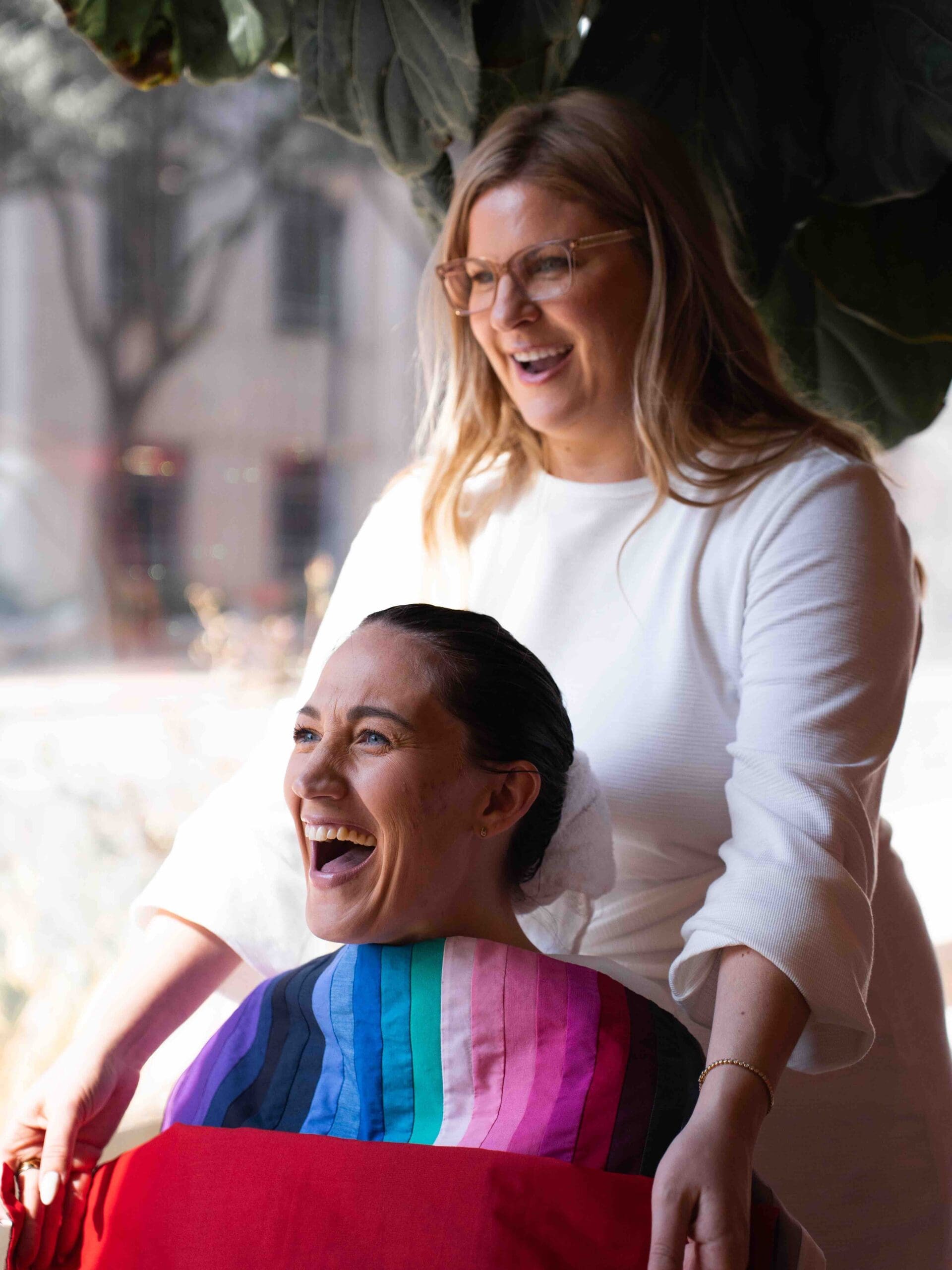
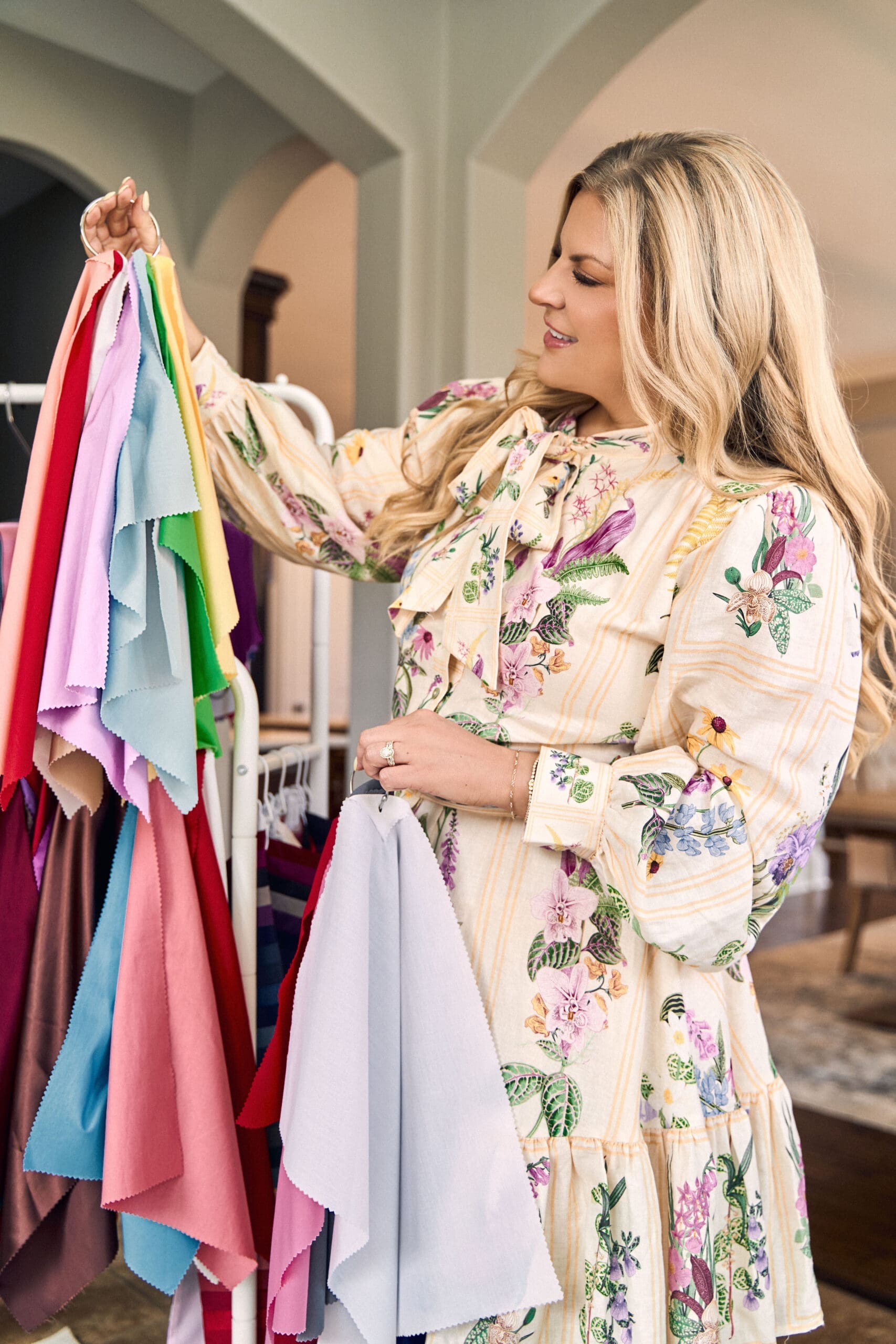
If you are unsure whether black is one of your best colors, a professional color analysis can show you exactly how different neutrals interact with your skin. At ATX Color Studio in Bee Cave, just outside Austin, we use detailed draping to identify your season, best neutrals, clothing colors, makeup shades, jewelry metals, and hair color direction.professional color analysis can give you total clarity and help you build a wardrobe that lights you up.

feartured post
Our New
Living Room
This could go to a blog post, an Amazon shop, a page of your site, your like to know it — whatever you want!


BEST THE JOURNAL
of
come visit the studio
LET'S FIND YOUR COLORS
Located in Bee Cave, just outside Austin. A relaxed, one-on-one experience designed to leave you feeling confident in every color you wear.


+ Show / Hide Comments
Share to: